Compassion’s Gamification: Redesigning the mobile app and creating additional web experiences to cultivate closer relationships between sponsors and their sponsored children using gamification elements.

PROJECT OVERVIEW
Conducted user research that helps determine future UX strategy and direction for game-like elements that motivates people to be or stay loyal to Compassion International as a user for All Websites & Mobile Apps.
Compassion International has about over 100+ links to other areas of the website, and one mobile app on the Apple App Store and Google Play store we want to up-level to Gamification design patterns or system.
My Scope:
User Research, UX Design, Ideation, User Interviews
Tools:
Figma, Userlytics, Quantum Metric, Google Analytics, Microsoft Excel
Client:
Compassion International
Duration:
8 Week Sprint; March 2022 - May 2022
My Role:
UX Design Intern II
The Team:
Me (UX Design Intern II)
Lary Stucker (Director of Digital Experiences)
Erik Carlson (Senior Manager of DX)
Jeff Thompson (Senior UX Architect)
Colin Sandlin (User Experience Specialist III)
Kristen Reyes (User Experience Specialist II)
WHAT IS COMPASSION INTERNATIONAL? - 3 Minute Video
Compassion International, Inc. is a registered 501(c)(3) nonprofit organization.
THE PROBLEM - WE WANT TO INCREASE…
Acquisition (Pre-sponsorship):
Acquire potential new sponsors by showing Compassion’s impact
Engagement (Post-sponsorship):
We want to increase letter writing between a sponsor and their sponsored child, the pit or valley of Compassion’s success
Retention (Post-sponsorship)
Longer sponsorship and more engagement/participation, increase in giving and letter writing
THE GOAL
Conduct research and testing with prospective and current sponsors to understand what impact gamification could have in their journey to becoming a sponsor/donor and becoming a more engaged sponsor/donor. Develop a business case utilizing customer insights to inform the next steps.
THE OKRs
Conduct primary research with target audiences (combination of qualitative & quantitative studies) and design concept testing to gather customer insights
THE OUTCOME
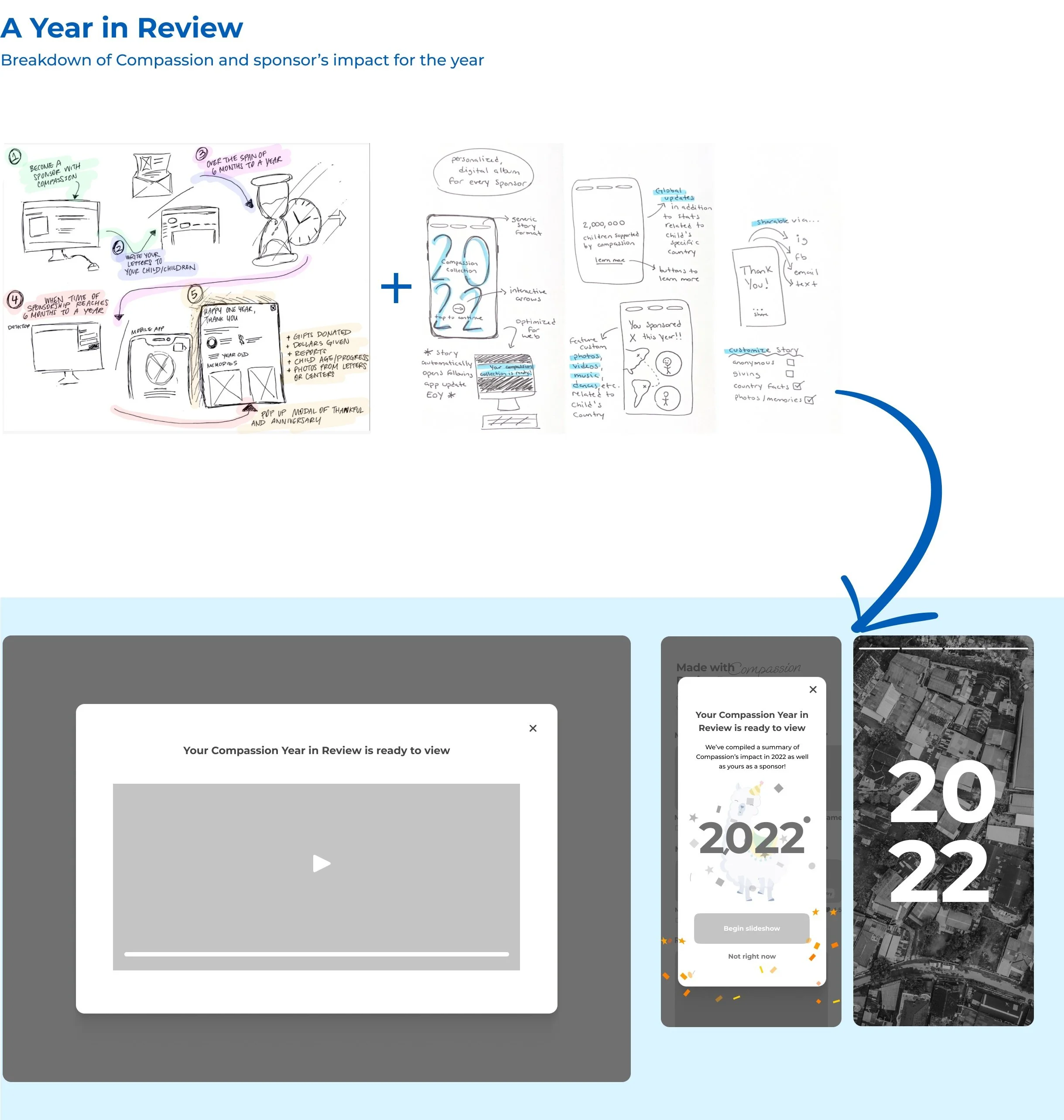
To address these problems, I design some screens within the .com experience, mobile app, and desktop app to help sponsors learn more about their sponsored children through learning dashboards, interactive maps within the onboarding process, an end of year review to show impact, and a letter-writing tracker.
DESIGN APPROACH
STAKEHOLDER INTERVIEWS
We first interviewed the Director of Digital Experiences and Behavioral Scientists to understand human behavior and how gamification correlates to Compassion’s current features. We want to pick their brain on what gamification design means to them.
Gamification to our organization means…

Users need…
SAFETY
Not manipulated from social pressure to sponsor a child
Not creeped out by sharing personal info with their child or the other way around
THE FIRST 6 MONTHS ARE VITAL TO RETENTION
Past research shows that the first 6 payments don’t start well
At concerts or events, people sponsor a child from social pressure from the people around them. After a few months, people justify why they shouldn’t sponsor a child.
ANY REWARDS SHOULD ALSO BENEFIT THE CHILD
The whole reason for Compassion and child sponsorship is to help children, not themselves.
SECONDARY RESEARCH
Next, we completed secondary research by watching Yu-Kai Chou’s video about gamification research and reading existing articles on gamification design elements to understand how we may use them. Also, to identify important questions and best practices within gamification design.
We stumbled upon 2 valuable pieces:
This video: Gamification to improve our world: Yu-kai Chou at TEDxLausanne
This article: HEXAD: A Player Type Framework for Gamification Design
Watched a video about gamification…
Yu-kai Chou is an entrepreneur, speaker, and gamification pioneer. Early in life, he had the epiphany that while games had the power to delight and engage the mind, they were not productive and only resulted in emotional gains. He is now a full-time consultant and speaker on gamification.
Findings (the 2 differences)…
Intrinsic motivation involves doing something because it's personally rewarding to you.
Extrinsic motivation involves doing something because you want to earn a reward or avoid punishment.
Chou reminded us of the importance of following a framework in general. We chose to use this framework because… there are six types of users described (at a basic level), instead of Ya-Kai Chou’s 8 types.
So how are Compassion’s current and potential users intrinsically/extrinsically motivated in their daily apps versus Compassion’s website & mobile App?
FURTHER RESEARCH
To get a general idea about the gamer-type of our current sponsors, we sent out a survey to current sponsors. We received 94 responses from current customers.
Participants were aged from 25 years old to 54 years old. This helped us target some problems to narrow down our topic of questions. For example, people are interested in game-like elements that were about serious fun or provided self-autonomy.
SURVEY TO CURRENT USERS INSIGHTS
Overall Improvements:
Saving photos and letters for later features to go back to
More customization when letter writing
Show more impact through confirmation and pictures
Onboarding/exit can be more fun
NEXT… I CONDUCTED 12 USER INTERVIEWS
We conducted 12 moderated interviews through Userlytics (5 with potential sponsors, 7 with current sponsors).
Questions were formed in a feature analysis based on the HEXAD framework for Gamification Design for us to understand the main gamer types of potential and current customers with Compassion:
Additionally, we conducted competitive research on existing game-like elements of other nonprofit organization websites. This helped us sort out what game-like elements motivate them the most to our goals.
I WAS CURIOUS TO EXPLORE…
FEATURE ANALYSIS INSIGHTS
POTENTIAL USERS…
were typically these gamer types
MOTIVATORS
Stats - Progress bars, data visuals, hide/reveal interactions or celebratory elements to make stats/numbers for interactive & discoverable
Map - Build upon “where we work” map to be more interactive & show growth of impact
NON-MOTIVATORS
Social Proof - Users didn’t care to see this kind of information unless it was specifically someone they knew
Animation - Not enough favor to take action or do anything with.
Fundraising Leaderboard - One user liked the competitiveness and familiarity to GoFundMe but overall users thought the layout on the page was out of order and felt like it was lacking the details they’d need to take action / get involved.
CURRENT USERS...
were typically these gamer types
MOTIVATORS
Letter Tracker - progress bar both ways, notifications, celebratory elements, approximate days, timeline
Unlock Templates - gamified way to reveal template is unlocked or notification
Stats - Progress bars, data visuals, hide/reveal interactions or celebratory elements to make stats/numbers for interactive & discoverable, anniversary
Trivia/quiz learning - daily fact cards, progress bars to show completion of learning, share with others, daily reads, learning videos
Celebratory Elements
NON-MOTIVATORS
Badges for Achievement - The current sponsors we interviewed were very humble and didn’t care too much about others seeing their own progress. Wanted to progress for their eyes only.
PERSONAS (Gamer Type Inspired) —
Based on the HEXAD framework above, I created these personas for the highlighted gamer types. Information was compiled from the gamer types of the 12 user interviews with current and potential users and 94 survey responses from current users.
TEAM IDEATION WORKSHOP
Based on user personas, and user research, we hosted a team workshop to explore ideas for designs we could implement.
Activities in this workshop included: a brain-writing activity where we each take a few minutes to write our ideas, and then we add on to the person next to us’s activity.
As a team, we all took our favorite ideas and completed crazy 8’s to start sketching out the ideas to life so we can turn them into mid-high fidelity prototypes we can use for user testing.
LOFI PROTOTYPES (CONCEPT TESTING)
7 moderated interviews with current sponsors for concept testing 5 Low-Fi Prototypes — Observations, Key Insights & Next Steps
OBSERVATIONS
#1 Favorite feature if they can learn about child
Remove leaderboard
Test fun facts vs. a quiz/course
A place to see/hear how child’s name is pronounced
Email updates from child’s center takes them here to learn more
OBSERVATIONS
Least favorite / least likely to use
One page report/summary vs. video or slideshow
A place for this to live so users can refer back to it
OBSERVATIONS
Tied #1 for “Favorite” concepts
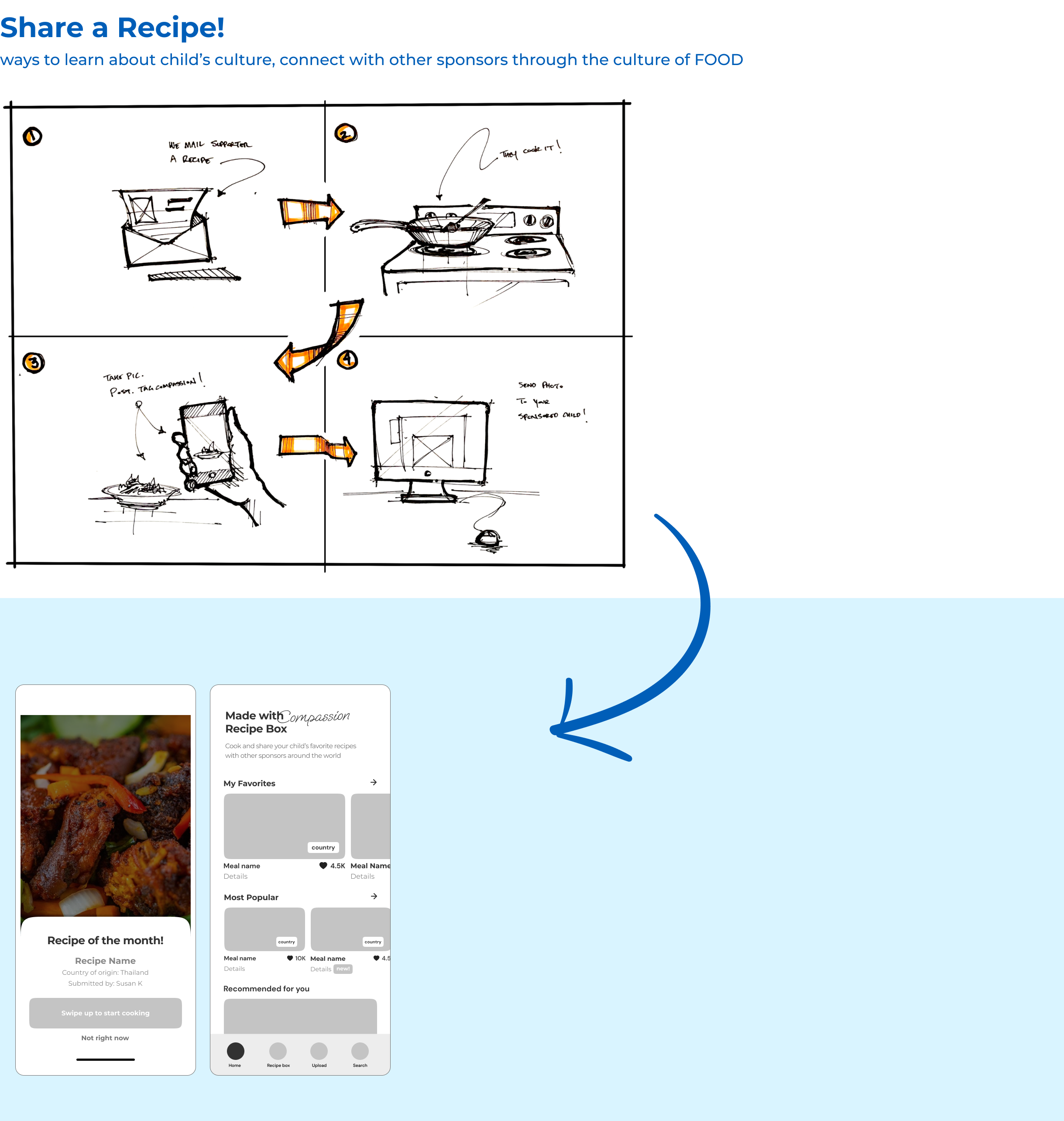
Sharing (with the child as a conversation starter, food with friends & family, Compassion Sunday, more sponsors)
Ingredients matter
Want to receive recipes electronically with the ability to print
OBSERVATIONS
Need Satisfied: Purpose & Accountability
Opt in - encourage child
Opt out - feels like a checkbox instead of it being about prayer, fear of deflation, already telling the child they are being prayed for
OBSERVATIONS
Need Satisfied: Trust, Transparency, Accountability
Visuals were intuitive - desire to see statuses both ways
Bonus content: Notes from the center
Users were not motivated by extrinsic incentives or leaderboards, only by what will help the child
Customization/Preferences are key:
Articles vs. videos
Opting out of prayer postcard
Map vs. list view
Concepts to move forward with:
Letter Tracker - 70/100
Prayer Feature - 66/100
Interactive Map - 64/100
Unlock Letter Templates - 87/100
REFLECTION -- WHAT I LEARNED
I'm proud to work on such a large-scale project from the very beginning. Thanks a lot to my team for believing me and supporting me throughout the process. I learned to collaborate with other Designers using tools like Miro, Userlytics, etc. I challenged myself to think of a lot of questions to test, present them to my manager, and test with users. I took advantage of our UX panel to ask for feedback proactively through a survey.
It was my first time working with gamification elements with UX Design and it was a lot of fun. I did a lot of secondary research on the best way to approach users and I discovered that game-like elements are very closely linked to motivations. Most users were intrinsically motivated by Mastery, Relatedness, Purpose and Autonomy.


