PROJECT OVERVIEW
Urbana.org is the landing page website for the Urbana Conference, the conference includes concerts, guest speakers, and fun events for an audience of over 10,000 people. This website is used to market the conference and invite people to sign up for email newsletters and purchase tickets.
My Scope:
User Research, Market Research, UX Design
Tools:
Figma, Miro, HotJar, Google Analytics, Xtensio, Salesforce, Drupal 9 CMS
Client:
Urbana Conference
Duration:
8 weeks; June 2021 - August 2021
My Role:
UX Design Intern
Team:
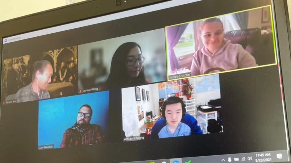
Ashley Crutcher (UX Manager)
Jeff Bunch (Director of Marketing)
William Cheung (UX Designer)
Steven Yeo (UX Designer)
Mary Massey (Developer)
Gary Nauman (Senior Graphic Designer)
THE PROBLEM
From the 1990s to the early 2000s — no other missions conference can compete with Urbana. So marketing was not a worry as we expected 20,000 participants to show up every three years. Over time, Urbana has been decreasing in popularity, at its height having 20,000+ participants and averaging between 14,000-15,000, at least 2,000 of which are staff and volunteers. For a while, Urbana was the only conference of its kind, but now competes with CrossCon, Passion Conference, and a few others.
THE PURPOSE
Jeff Bunch, Urbana's Director of Communications and Urbana Conference’s 4 core teams in their decision-making around
Landing page design
Messaging and channels to best reach the audience
Motivate audience to attend the conference via. email sign-up
THE GOALS
We want you to purchase a ticket and come excited!
THE OUTCOMES & RESULTS
Since this is a marketing website, the bounce rate has decreased by 80.2% and the duration per session has lengthened, with more sessions than ever, despite the little increase in users
THE DESIGN PROCESS
THE RESEARCH & INITIAL DISCOVERY—
USER INTERVIEWS
I conducted 15 1-on-1 moderated generative interviews to gather qualitative data to analyze people’s expressions, understanding, and opinions on the Urbana conference around:
What our audience’s expectations for a conference might be.
What could motivate them to attend.
What channels might have the best reach.
What visual directions are resonating.
Why this method?
Explore the barriers and attitudes towards conferences
To hear their past experiences with Urbana in order to improve future Urbana conferences
Seek marketing strategy and channels in which are best to reach them
Find out how students are introduced to Urbana for their first time
Insights: People were most motivated to attend the conference if they heard good testimonies from word of mouth or watched a video
Top Messaging
8/13 users go on Urbana’s Instagram for event news
WEBSITE BRANDING FOR WEBSITE MOOD
To discover how the mood of the conference should feel to people, and how the website should resemble that…
We created a mood board that resembles the Urbana team’s creative exploration board. We asked 8 people during the user interviews how they would visualize the book of Acts.
Insights: Newer generation really want to see lots of colorful graphics on screen, with warm colors. A website that shows the conference represents community
ARCHETYPES
These archetypes are compiled from 15 user interviews of students, staff, and the upcoming populations of college students of 2021
They include recommendations from the audience for how to market the conference, the best marketing channels to reach the audience, and their concerns about the conference as a whole.
COMPETITIVE ANALYSIS
I looked into 5 other conference websites and how they market their conferences viewing their…
Messaging
Strengths
Weaknesses
Features
Prices
Promotions
Insights: Other conference websites had easy logistics, dark color theme, showed a lot of details about speakers, which the users who I interviewed, really enjoyed and found useful.
INSTAGRAM PAGE AUDIT (MARKETING PERSPECTIVE)
Assessed Levels of engagement (are we responding to comments, how is our user-generated content)?
Less than 37% nurture engagement
Figured out what Instagram posts were working well for engagement and which ones are not
Videos of speakers, and during event
Giveaways
LOW-LEVEL SITE MAP
Based on user interviews, I figured out how to layout the new navigation bar
THE PROPOSED SOLUTION
High-fidelity
Landing Page Prototype
REFLECTION — WHAT I LEARNED
I'm proud to work on such a large-scale project responsible for marketing and so many people who could potentially attend this conference. Thanks a lot to my team for believing me and supporting me throughout the process. I learned to collaborate with cross-functional teams, the Marketing team and the Marketing Director.
It was a learning experience to design for kids because I had to design with Graphic Designers that were still in the process of figuring out the colors for the conference.


