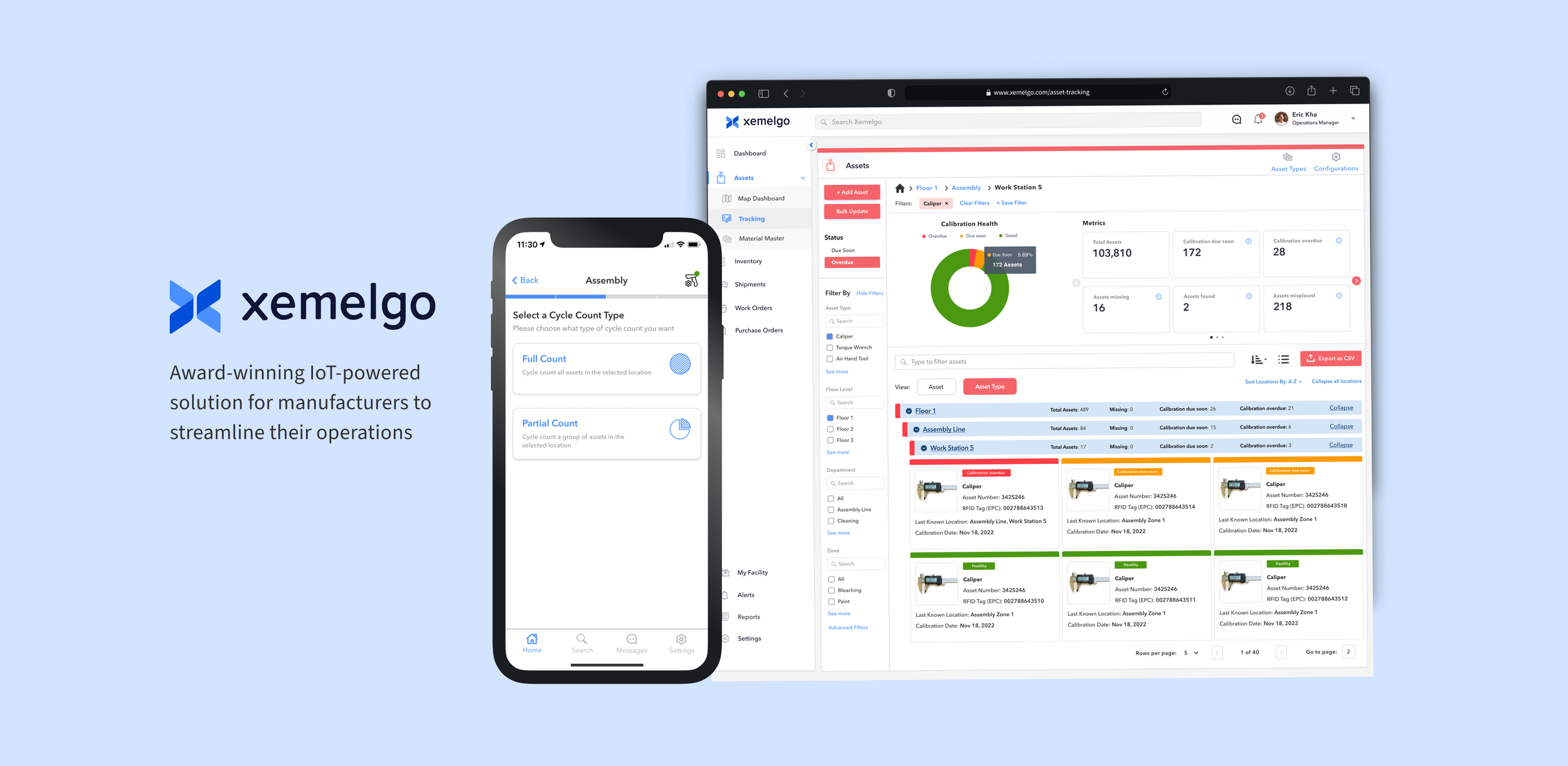
Award-winning IoT-powered solution for manufacturers to streamline their operations

🎯 Project Overview
I primarily dedicated my efforts to improving the asset management dashboard feature. Thanks to a supportive team, I was able to grow as a junior designer and hone my user research skills to inform my design choices.
* Property of Xemelgo📱 Platforms: Web app & mobile app
🎨 Design Scope:
Web Dashboard redesign
Side-bar navigation redesign
Mobile app onboarding of assets redesign
Mobile app cycle counting redesign
🤝🏻 Team Collaboration:
Me & 1 other UX Designer
15 Engineers
Customer Success Lead
Product Manager
VP of Sales
Executive team (stakeholders)
Problem: People on manufacturing floors face tool loss and missed calibration dates, requiring more real-time visibility on the factory floor.
Solution: Xemelgo's solution uses a combination of software and sensor technology to track the location of all tools in the factory. Eliminating manual data entry of information: inefficient and slow process.
Operational Dashboard Redesign
Refreshing the Asset Tracking Dashboard
The dashboard was in dire need of a redesign due to an outdated UI, it didn’t fit some of the new use cases manufacturing businesses had. Our designs were informed by user research and performing testing on manufacturing sites.
🥅 Goals: Provide hierarchical filtering and sorting of assets, provide the ability to know how many assets are available in a particular floor, department or room
📊 Metrics: — ROI, time-savings, on-time tool calibration, ease of use
BEFORE
Legacy dashboardAFTER
Updated designInitial Research
The executive team had gone out to multiple factories to perform user interviews with those who use our product on the floor and realized areas of improvement for the dashboard page.
💡Insights: In cases where companies need to track large tools, such as those used for carrying rocket parts or large bins, a single tag may not be sufficient to capture their movement in different directions. To ensure complete asset readability, multiple tags should be placed on the tool and mapped to the asset.
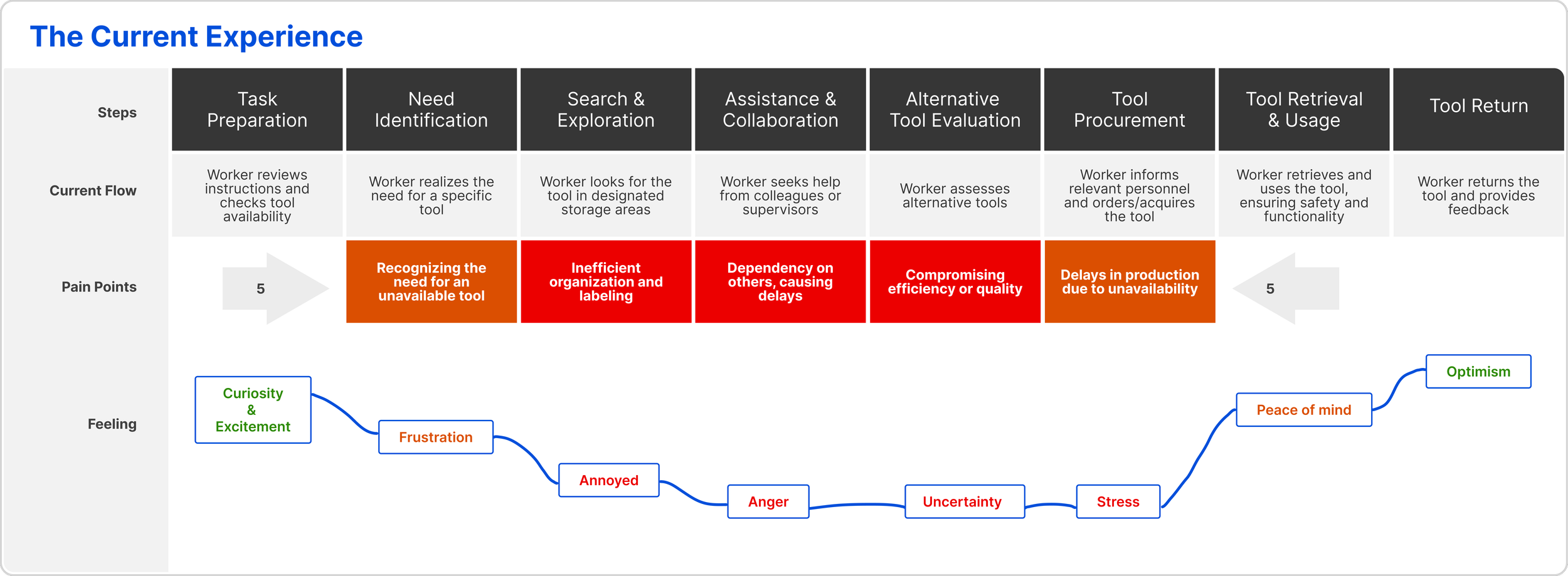
User Journey Map
User journey mapping revealed insights into the experiences and pain points of manufacturing floor workers (Quality Managers, Plant Managers) when finding assets/tools, informing potential improvements
Buyer Persona
By understanding factory floor workers and the CEO for the use case of tracking assets, understanding what they care about and what they look to improve when it comes to their business, we can perform testing to see if our product produced any result for them.
Personas came from insights founded from user interviews with former quality managers that worked on the factory floor, collaboration with PM, and Customer Success.
Design Goals
📑 Filtering/ Sorting of assets (Asset Hierarchy)
Assets in a facility can be owned by various groups/departments, each with its own asset categories. However, the current layout of having all asset types on a single page view makes asset sorting challenging.
🛠 Support multiple sensors on an asset
We use RFID readers to detect RFID tags. Certain companies require tracking of large tools, such as rocket-carrying tools and giant bins. For effective tracking, multiple tags should be placed on these tools to ensure complete readability, particularly when considering their movement in different directions.📍 Provide the ability to know how many assets are available in particular areas
Our asset tracking system currently lacks the capability to track asset inventory quantity within specific departments, rooms, or locations, including cases where assets enter and exit through the same door.
How might we design our web application dashboard to fit every type of business use case when tracking assets (assets of all sizes, materials, storage methods, etc)?
Filtering by factory floors department & zones
We wanted to have a more convenient option for users who wanted to look into if certain tools in each factory floor level, department, and working zones need to be calibrated status.
A business goal was to introduce metrics and location information to inform users which areas of the factory certain tools are located.
During onboarding, users can input multiple RFID tags
The proposed solution is effective and fast to onboard as many tags a user would like on bigger tools like the one below:
Know how many assets are available in a particular departments, zones and rooms
We wanted to have a more convenient option for users who wanted to look into if certain tools in each factory floor level, department, and working zones need to be calibrated status.
Bringing more visibility into every area and where the tools that need calibration or are due for calibration soon are located.
What happens when you click on a card?
2 use cases: Calibration date tracking, Location tracking
Internet of Things (IoT)
So how does a user actually find a tool on the factory floor?
Fixed/mounted sensor readers capture real-time tool location data, accessible to factory floor managers and workers via. the web or mobile app. With the mobile app's search & find feature and a handheld sensor scanner, users locate tools quickly in seconds.


Mounted RFID sensor readers

Handheld RFID sensor scanner + mobile app
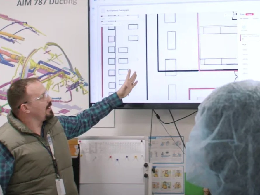
Xemelgo Web App on a TV at a factoryUser Feedback from customer
I collaborated with customer success and sales and went to a customer’s factory to actively listen to users as they shared their experiences before using Xemelgo, their current experience using it, and overall product feedback.
💡Insights:
✔️ Business have high amounts of time savings
✔️ Xemelgo Product is easy to use
✔️ Overall high return on investment from using Xemelgo
20X
Annual ROI
67%
Time Savings
100%
On-time Calibration
ADDITIONAL DESIGNS
Navigation Side bar Redesign
Design Goals
🖥 Users should know which solution they are using when it collapsed
As we build more solutions and features inside each solution within the web app, it was not scalable. Each feature under the solution had the same icon. If users are in a collapsed default state, they should see the nested icons under the parent solution
Collapsed state
I redesigned new icons to represent the asset map feature and tracking page feature
In a collapsed sidebar navigation, icons, and visual cues play a crucial role by providing compact and recognizable representations of the main sections or categories, aiding in quick navigation and maintaining a visual hierarchy within limited space.
Expanded state
Icons and visual cues in an expanded sidebar navigation help improve usability and recognition by providing intuitive graphical representations and visual indications of the active state, enabling users to navigate efficiently and maintain a clear understanding of the system's structure.
ADDITIONAL DESIGNS


